Histograms are a fundamental tool in statistics, commonly used for summarizing and understanding large sets of numerical data. In this blog, we’ll explore what histograms are and how they work, using simple language and concepts.
What is a Histogram?
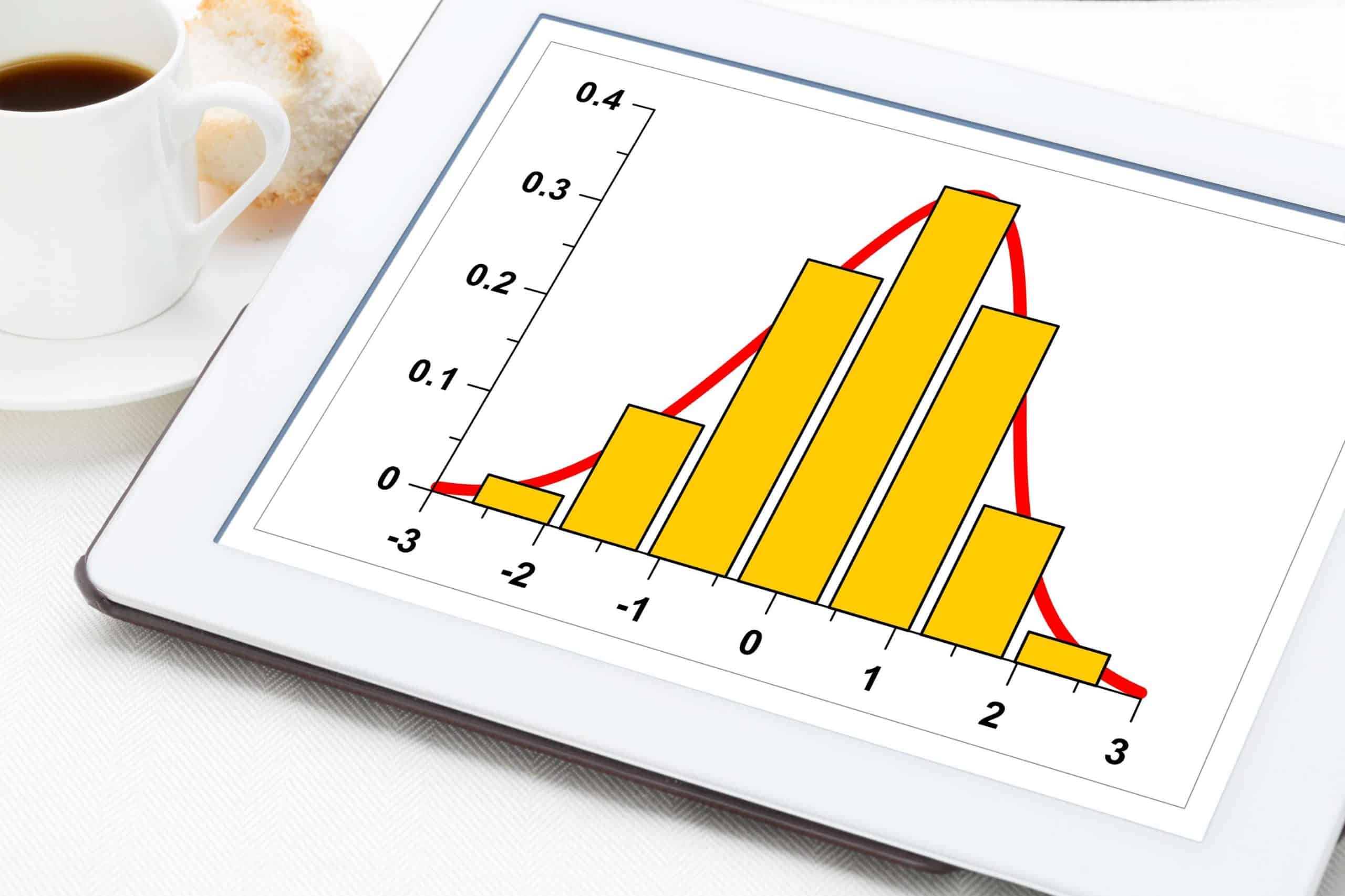
A histogram is a type of graph used to represent the distribution of a dataset. It’s similar to a bar chart, but while a bar chart represents categorical data, a histogram represents numerical data. This distinction is crucial: histograms help us understand the spread and shape of continuous data.
Definition:
A histogram is a graphical representation of the distribution of numerical data. It is an estimate of the probability distribution of a continuous variable and was first introduced by Karl Pearson.
Structure of a Histogram:
- Axes: The horizontal axis (x-axis) represents the bins or intervals of data. The vertical axis (y-axis) shows the frequency, i.e., how many data points fall into each bin.
- Bins: Bins are essentially intervals that group the data points. The width of each bin shows the range of data it includes, and the height reflects the frequency.
- Bars: Unlike bar charts, the bars in a histogram touch each other, indicating the continuous nature of the data.
Types of Histograms:
- Uniform Histogram: Each bin has an approximately equal number of data points.
- Symmetrical Histogram: The left and right sides are mirror images of each other.
- Skewed Histogram: The data tails off to one side. It can be left-skewed or right-skewed.
- Bimodal/Multimodal Histogram: There are two or more peaks, showing that data has multiple significant groupings.
Creating a Histogram:
- Data Collection: Start with a set of data.
- Determine the Number of Bins: Too few bins can oversimplify reality, while too many bins can complicate the picture.
- Range Calculation: Calculate the range of the data (max value – min value).
- Bin Width Calculation: Divide the range by the number of bins.
- Allocation of Data Points: Sort each data point into the appropriate bin.
- Plotting: Draw the histogram with bins on the x-axis and frequency on the y-axis.
Reading a Histogram:
- Central Tendency: Look for where most of the data is concentrated.
- Spread: Assess how spread out the data is.
- Skewness: Determine if the data leans more towards the left or right.
- Outliers: Identify any bars that are unusually high or low compared to the rest.
Applications of Histograms:
- Data Analysis: For summarizing large data sets visually.
- Quality Control: In manufacturing, histograms can show the distribution of product dimensions or durations.
- Finance: Used to represent the distribution of returns on assets.
- Natural Sciences: To display the distribution of a measurement like height, weight, or temperature.
Advantages and Limitations:
- Advantages: Histograms are easy to understand and can handle a large range of data values.
- Limitations: The choice of bin size and range can influence the interpretation of the data, and they are not suitable for categorical data.
How Does a Histogram Work?
1. Data Collection and Preparation
- Initial Step: The process begins with a collection of continuous numerical data. This data can be anything from heights of individuals, temperatures over a month, to scores in an examination.
- Data Cleaning: Ensure the data is clean and relevant. This might involve removing outliers or erroneous entries that could skew the results.
2. Determining Bin Size and Range
- Range of Data: Calculate the range (the difference between the maximum and minimum values).
- Deciding Bin Size: Choose how many bins (or intervals) you want to divide your data into. The choice of bin size can significantly affect the histogram’s representation. There are different rules of thumb for this, like Sturges’ formula, the Rice Rule, or the Square-root choice.
- Equal Width Bins: Typically, each bin has an equal width, but this isn’t a strict rule. The width is determined by dividing the range by the number of bins.
3. Sorting Data into Bins
- Allocation: Each data point is placed into a bin. For example, if a bin represents values from 10 to 20, all data points within this range go into this bin.
- Frequency Count: Count how many data points fall into each bin. This count is known as the frequency.
4. Plotting the Histogram
- X-axis: The bins are represented on the horizontal axis (x-axis). Each bin is labeled with the range of values it contains.
- Y-axis: The vertical axis (y-axis) represents the frequency of the data.
- Drawing Bars: Draw bars for each bin. The height of each bar corresponds to the frequency of the bin.
5. Analyzing the Histogram
- Shape of the Data: The overall shape of the histogram can give insights into the data’s distribution – whether it’s symmetric, skewed, bimodal, etc.
- Central Tendency and Spread: Histograms help in identifying the mode (most frequent data points) and understanding the spread (range and distribution) of the data.
- Outliers and Gaps: Look for unusually tall or short bars that might indicate outliers or gaps in data.
6. Adjustments and Refinement
- Re-evaluating Bin Size: If the histogram doesn’t quite illustrate the data effectively, adjusting the number of bins or their width might be necessary.
- Multiple Histograms for Comparison: Sometimes, overlaying multiple histograms for different data sets on the same axes is useful for comparison.
7. Practical Considerations
- No Gap Between Bars: Unlike bar graphs, histogram bars touch each other. The continuous nature of the data means there are no gaps between intervals.
- Uniformity: While bins are typically uniform in size, there are instances where varying bin widths are used, particularly when representing data on a logarithmic scale.
Why are Histograms Useful?
1. Visualization of Data Distribution:
- Clarity in Data Representation: Histograms transform complex datasets into a format that’s much easier to understand at a glance.
- Revealing Distribution Patterns: They are excellent for showing the shape of the data distribution – whether it’s normal, skewed, bimodal, etc.
2. Identification of Central Tendencies and Spread:
- Mode Identification: Histograms make it easy to spot the mode, or the most common value in a dataset.
- Understanding Variability: They help in understanding the spread of the data, including the range and dispersion.
3. Detection of Skewness and Outliers:
- Skewness: Histograms clearly show if the data is skewed to the left or right.
- Outlier Identification: Unusually tall or short bars can indicate outliers or anomalies in the data.
4. Comparison Between Different Data Sets:
- Multiple Datasets: Overlaying histograms for different datasets allows for direct visual comparison.
- Useful in Various Fields: This is particularly beneficial in fields like market research, scientific research, and quality control.
5. Decision Making in Business and Industry:
- Performance Analysis: Businesses use histograms to analyze performance metrics, customer satisfaction ratings, sales data, etc.
- Quality Control: In manufacturing, histograms help in monitoring product dimensions and identifying variations from the standard.
6. Facilitating Statistical Analysis:
- Foundation for Further Analysis: Histograms are often a starting point for more detailed statistical analysis, like determining probability distributions.
- Useful in Hypothesis Testing: They provide a visual way to test hypotheses about data distribution.
7. Educational Tool:
- Teaching Aid: Histograms are widely used in educational settings to teach students about data distribution and statistical concepts.
8. Customizability and Flexibility:
- Adaptable to Different Scales: Histograms can be adjusted for different scales and data ranges.
- Variable Bin Sizes: They can be tailored with different bin sizes to highlight specific aspects of the data.
9. Real-World Applications:
- Healthcare: Used to analyze patient data, like blood pressure readings or cholesterol levels.
- Environmental Studies: Helpful in analyzing meteorological data like temperature or rainfall patterns.
- Finance and Economics: Utilized for analyzing income distributions, stock returns, and market trends.
10. Digital Image Analysis:
- Photography and Image Processing: Histograms are crucial in digital image processing for analyzing the brightness and contrast of images.
Limitations & Considerations:
While histograms are incredibly useful for data analysis and visualization, they do have certain limitations and considerations that need to be kept in mind. Understanding these constraints is crucial for correctly interpreting the data represented by histograms.
Detailed Limitations and Considerations of Histograms
1. Choice of Bin Size and Range
- Bin Size Impact: The number and size of bins can significantly affect the histogram’s appearance and the conclusions drawn from it. Too many or too few bins can lead to misleading representations.
- Subjectivity in Bin Selection: There is no universally accepted rule for choosing bin sizes, making it somewhat subjective and potentially leading to inconsistent interpretations.
2. Loss of Specific Data Points
- Generalization of Data: Histograms provide an overview of the distribution but do not convey exact values of data points. Individual data specifics are lost in the grouping process.
- No Information on Each Entry: Unlike scatter plots, histograms do not show every instance of the data, which can be a drawback when specific data points are important.
3. Difficulty in Comparing Multiple Distributions
- Overlapping Issues: When multiple histograms are overlaid for comparison, they can become cluttered and hard to interpret, especially if they have different scales or units.
- Scaling Challenges: Comparing datasets with vastly different scales can be challenging in histogram form.
4. Not Suitable for All Types of Data
- Limitation to Quantitative Data: Histograms are ideal for continuous or large discrete numerical data but are not suitable for categorical data.
- Challenges with Small Data Sets: They may not be as effective for very small datasets, as the patterns may not be apparent.
5. Misinterpretation of Skewness and Outliers
- Sensitivity to Skewness: The interpretation of skewness in data can be highly sensitive to how bins are defined.
- Outlier Influence: A few outliers can significantly impact the histogram’s shape, potentially leading to misleading interpretations.
6. Potential for Misleading Visuals
- Visual Bias: The way a histogram is presented (such as scale, bin width, and axis labels) can create visual biases.
- Comparison Difficulty: Directly comparing histograms can be difficult without a standardized scale.
7. Impact of Data Range and Distribution
- Data Range Limitations: The histogram’s effectiveness can be limited if the data range is too narrow or too wide.
- Assumption of Uniformity: Histograms assume data within a bin is uniformly distributed, which might not always be the case.
8. Statistical Assumptions
- Assumptions on Distribution: Histograms can lead to assumptions about data normality or other distribution types, which may not be accurate without further statistical testing.
9. Technical and Resource Considerations
- Software and Skill Requirements: Creating accurate and effective histograms requires statistical software and a certain level of proficiency in using it.
- Resource Intensive for Large Data Sets: Processing extremely large datasets for histograms can be resource-intensive.
Example in Real Life:
Imagine a school principal trying to understand the performance of students in an exam. By plotting the scores in a histogram, the principal can quickly see how many students scored in different ranges (like 0-10, 11-20), identify the most common score range, and see if there are any unusually high or low scores.
Conclusion:
Histograms stand out as a fundamental tool in the realm of statistical analysis and data visualization. Their simplicity in design belies their profound capability to transform raw, complex numerical data into visually intuitive and interpretable graphs. Here’s an expanded conclusion on how histograms function in the representation of data:
Final Thoughts:
In conclusion, histograms are a potent and essential tool in the arsenal of data analysis, capable of unlocking insights from numerical data in a visually accessible manner. Their utility spans across various domains, aiding in revealing the hidden stories within datasets. However, their effectiveness is contingent upon mindful usage, considering their limitations and the potential for misrepresentation. With a balanced approach, histograms continue to be a foundational component in the art and science of data interpretation and analysis.


0 Comments